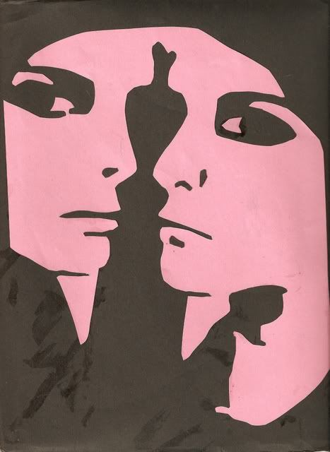
Well, as I mentioned in class, there was supposed to be another half to this piece in baby blue, which I finished and actually like better than the pink one. The detail is better (I used an Xacto knife instead of regular scissors), the canvas isn't covered in rubber cement residue, and I cut out some of the unnecessary shapes that the cutout filter creates (all my extra chins).
I'll post it as soon as my scanner starts working again, but for now, here's the one from class:

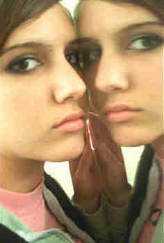
and the original photo (oh to be 16 again!):
 UPDATE:
Here's the blue one.

 UPDATE:
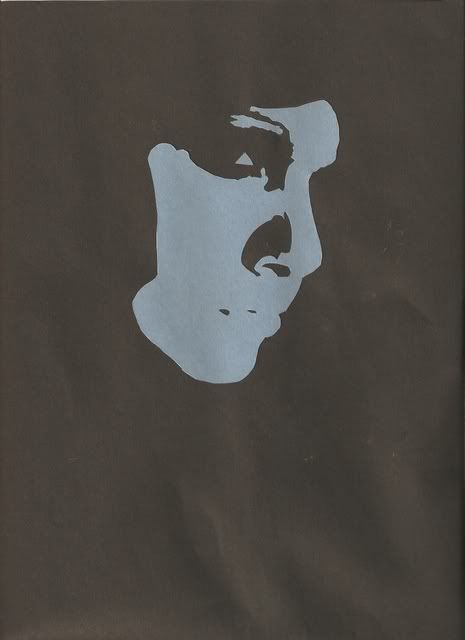

I kinda like the blue one a little more. It is very subtle and mysterious. Almost as if it could be anyone, which i guess could be bad for a self-portrait...
ReplyDeleteI really like the blue one! It seems more introverted and surreal, like you are disappearing into the page. I also like the fact that it has more details.
ReplyDeleteI agree that the blue is really nice, but I also like the first a lot. The pink, to me, almost looks like a Rorschach test...which adds an interesting element to the idea of a self-portrait.
ReplyDelete